As I sit amidst my loom and threads, I often think about the common misconception that using a color wheel for yarn pairing is a rigid, formulaic process. But the truth is, how to use a color wheel for yarn pairing is more of an art than a science. It’s about understanding the nuances of color and texture to create something truly unique. I’ve seen many weavers get frustrated with the idea that they need to follow a specific set of rules to achieve harmony in their yarn pairings. But I’m here to tell you that it’s not about following rules, it’s about building a relationship between colors and textures.
In this article, I’ll share my personal approach to how to use a color wheel for yarn pairing, one that emphasizes experimentation and creativity. I’ll guide you through my process of selecting yarns that not only complement each other in terms of color, but also in terms of texture and form. You’ll learn how to trust your instincts and make intentional decisions about your yarn pairings, rather than simply following a formula. By the end of this article, you’ll be equipped with the knowledge and confidence to create your own unique and stunning woven pieces, and to see the color wheel as a tool, not a rulebook.
Table of Contents
Guide Overview: What You'll Need
Total Time: 1 hour 15 minutes
Estimated Cost: $10 – $20
Difficulty Level: Easy
Tools Required
- Color Wheel Chart printed or digital version
Supplies & Materials
- Yarn Samples various colors and textures
- Paper or Digital Notebook for recording color combinations
Step-by-Step Instructions
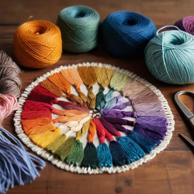
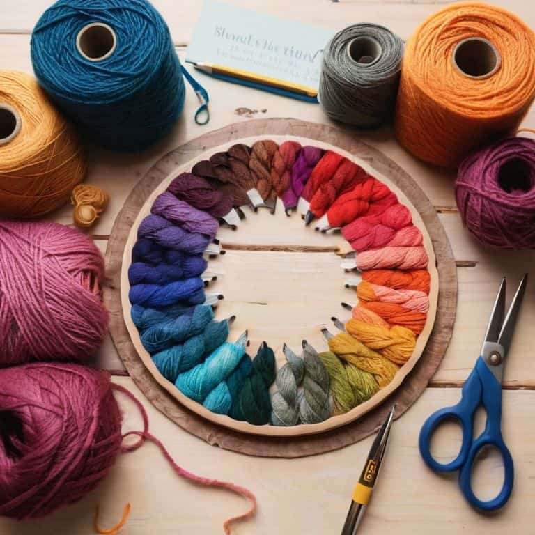
- 1. To start, let’s get familiar with the color wheel – I like to think of it as a map for navigating the world of colors. Begin by printing out a color wheel chart or using a digital version on your device. Take a few minutes to study the color wheel, noticing how colors are arranged in a harmonious circle. This will help you understand the relationships between different hues and how they can be used to create stunning yarn pairings.
- 2. Next, choose a starting point by selecting a color that inspires you – this could be a favorite hue, a color that matches your home decor, or one that evokes a particular emotion. Once you’ve chosen your starting color, locate it on the color wheel. Take note of the colors directly adjacent to your starting color, as these are called analogous colors and can create a smooth, cohesive look in your woven piece.
- 3. Now, let’s explore complementary colors – these are colors that are directly opposite each other on the color wheel. Complementary colors can add a pop of contrast and visual interest to your yarn pairings. For example, if your starting color is blue, the complementary color would be orange. Don’t be afraid to experiment with different combinations to find the perfect balance of warm and cool tones.
- 4. To add depth and complexity to your yarn pairings, consider using split-complementary colors. This involves choosing a color, then selecting the two colors on either side of its complementary color. For instance, if your starting color is blue, the complementary color is orange, and the split-complementary colors would be red-orange and yellow-orange. This technique can create a rich, nuanced palette that adds dimension to your woven art.
- 5. Another approach to yarn pairing is to use triadic colors, which involve selecting three colors equally spaced from each other on the color wheel. This can result in a vibrant, energetic palette that’s perfect for creating a statement piece. When working with triadic colors, be mindful of the balance between warm and cool tones to ensure a harmonious overall effect.
- 6. As you experiment with different yarn pairings, remember to consider the 60-30-10 rule – this means allocating 60% of your palette to a dominant color, 30% to a secondary color, and 10% to an accent color. This guideline can help you achieve a balanced, visually appealing composition in your woven art. Don’t be afraid to adjust the proportions to suit your personal taste and the specific project you’re working on.
- 7. Finally, test your yarn pairings by wrapping the chosen colors around a cardboard loom or a piece of cardboard to see how they interact with each other. This will give you a sense of the overall texture and color harmony of your woven piece. Take note of how the colors work together, and make any necessary adjustments before beginning your project. By following these steps and trusting your creative instincts, you’ll be well on your way to crafting unique and captivating yarn pairings that elevate your woven art to the next level.
Yarn Pairing Mastery
As I delve deeper into the world of yarn pairing, I’ve discovered that yarn color matching tips are essential to creating a cohesive and visually appealing piece. One technique I find particularly useful is using analogous colors, which involves selecting hues that are next to each other on the color wheel. This approach can add a sense of depth and dimension to your woven art, making it more engaging and dynamic.
When exploring color harmony in knitting or crochet, it’s also important to consider the 60-30-10 rule. This principle suggests that dominant colors should occupy about 60% of the design, while secondary colors take up 30%, and accent colors make up the remaining 10%. By applying this guideline, you can achieve a sense of balance and proportion in your work, allowing the different yarn colors to work together in harmony.
To take your yarn pairing to the next level, experiment with complementary color schemes. This involves pairing colors that are opposite each other on the color wheel, creating a striking contrast that can add energy and visual interest to your textiles. Alternatively, you can also explore monochromatic yarn color ideas, which involve using different shades of the same color to create a cohesive and sophisticated look.
Unlocking Complementary Color Schemes
As I delve into the world of complementary colors, I’m reminded of the striking contrasts found in nature – the vibrant hues of a sunset or the bold patterns of a butterfly’s wings. When working with complementary colors, I consider the 60-30-10 rule: 60% of the dominant color, 30% of the secondary color, and 10% of an accent color. This balance creates a visually stunning piece that’s both harmonious and bold. I love experimenting with unexpected pairings, like turquoise and coral, to add a touch of sophistication to my woven art.
By embracing complementary colors, you can add a new layer of depth and emotion to your weaving. Remember, the key is to balance contrasting hues in a way that creates tension and harmony simultaneously. As you explore this technique, don’t be afraid to push boundaries and try unconventional pairings – it’s often the most unexpected combinations that lead to truly breathtaking results.
Weaving Harmony With Analogous Colors
As I delve into the world of analogous colors, I’m reminded of the subtle nuances in architectural design. Just as a well-crafted building blends seamlessly into its surroundings, analogous colors in weaving create a harmonious visual flow. By selecting yarns that are next to each other on the color wheel, I can craft a piece that exudes cohesion and balance. The result is a woven art installation that invites the viewer to step into its serene atmosphere.
I find that working with analogous colors allows me to emphasize texture and form, much like the play of light on a beautifully crafted wooden beam. The gentle gradations of hue create a sense of depth, drawing the eye through the piece. As I weave, I feel like I’m building with yarn, each thread carefully considered to create a sense of harmony and visual interest.
5 Essential Tips for Architecting Your Dream Yarn Pairings with a Color Wheel
- I always start by selecting a core color that inspires me, and then use the color wheel to find its perfect match – whether that’s a complementary, analogous, or triadic partner
- Remember, the key to weaving harmony is balance: don’t be afraid to introduce neutral tones to ground your design and let your chosen colors shine
- Experimenting with different yarn weights and textures can add an extra layer of depth to your color pairings – think of it as adding different materials to your architectural design
- When working with analogous colors, consider the 60-30-10 rule: use your dominant color for 60% of the design, your secondary color for 30%, and your accent color for 10%
- Don’t forget to trust your instincts and have fun – the color wheel is a tool, not a rulebook: feel free to break the rules and create something entirely unique and breathtakingly beautiful
Key Takeaways for Mastering Yarn Pairing with a Color Wheel
Weaving with a color wheel helps to unlock harmonious and complementary color schemes, allowing you to architect your dream yarn pairings with precision and creativity
By understanding analogous and complementary colors, you can create stunning textile designs that showcase texture, form, and beauty, one thread at a time
Experimenting with different yarn colors and combinations using a color wheel will help you develop your unique artistic voice and style, making each woven piece a reflection of your personal vision and expression
Weaving Wisdom
As I see it, the color wheel is not just a tool, but a gateway to unlocking the hidden harmonies within our yarns, allowing us to craft woven pieces that resonate with the beauty of the world around us.
Ethan Thorne
Weaving a World of Color
As we conclude our journey through the world of yarn pairing with the color wheel, remember that the key to unlocking your creative potential lies in understanding the relationships between colors. We’ve explored how to use the color wheel to find analogous colors that create a sense of harmony and complementary colors that add a pop of contrast. By applying these principles, you’ll be well on your way to becoming a master yarn pairer, capable of crafting woven pieces that are both visually stunning and deeply personal.
So, the next time you sit down at your loom or pick up your knitting needles, I encourage you to think of the color wheel as a tool for storytelling. What emotional resonance do you want your woven piece to convey? What colors will you choose to evoke a sense of calm, or energy, or playfulness? The possibilities are endless, and I invite you to join me on this never-ending journey of discovery, where every thread is a brushstroke and every weave is a work of art.
Frequently Asked Questions
What if my favorite yarn colors don't appear to match on the color wheel, can I still make them work together?
Don’t worry if your favorite yarns don’t match on the color wheel – sometimes the most intriguing combinations come from unexpected pairings. Consider the 60-30-10 rule: use one dominant color, a secondary color, and an accent color to create visual harmony, even with unconventional matches. Experiment and trust your instincts to find a unique balance that works for you.
How do I balance warm and cool colors in a single weaving project to create visual interest?
To balance warm and cool colors, I like to think of it as designing a room – you need harmony and contrast. Try pairing warm earth tones with cool blues or greens, and use neutral shades to bridge the gap. This blend will create a visually interesting piece that’s both soothing and stimulating, much like a well-designed architectural space.
Can I use the color wheel to create a monochromatic color scheme with different shades of the same yarn color?
Absolutely, you can create a stunning monochromatic color scheme using different shades of the same yarn color. Think of it as building a nuanced texture with varying depths of a single hue. The color wheel can guide you in finding harmonious shades, from light to dark, to add richness and visual interest to your woven piece.