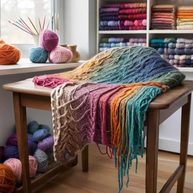
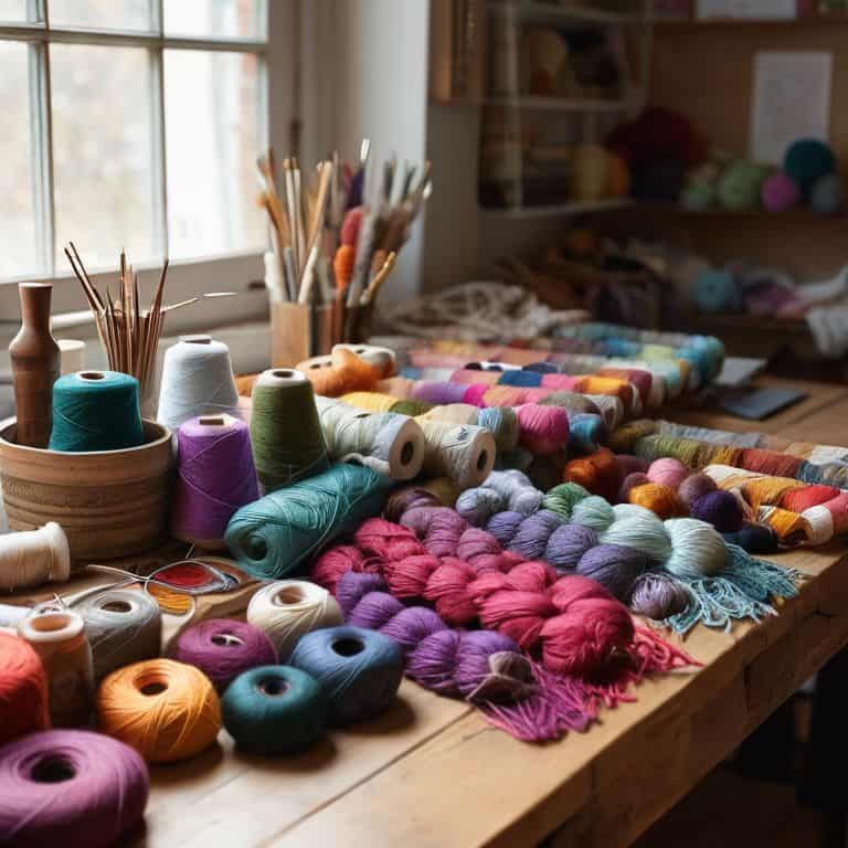
I still remember the first time I attempted a colorwork project – I was so overwhelmed by the endless possibilities that I ended up with a palette that was more chaotic than charming. But as I delved deeper into the world of knitting, I realized that choosing colors for a colorwork project is not just about selecting a few hues that look good together, but about creating a harmonious balance that brings your design to life. It’s a process that requires patience, experimentation, and a willingness to take risks. As I sit here surrounded by skeins of yarn in every color imaginable, I’m reminded of the joy that comes with discovering the perfect combination.
In this article, I’ll share my personal approach to choosing colors for a colorwork project, including practical tips and tricks for creating a palette that’s both unique and visually stunning. You’ll learn how to trust your instincts and let your personal style shine through in your color choices, rather than following rigid rules or trends. By the end of this guide, you’ll be equipped with the confidence and knowledge to tackle even the most complex colorwork projects, and to create beautiful, one-of-a-kind pieces that reflect your own unique sense of style.
Table of Contents
Guide Overview: What You'll Need
Total Time: 1 hour 30 minutes
Estimated Cost: $10 – $30
Difficulty Level: Easy
Tools Required
- Color Wheel (optional)
- Computer or Mobile Device (with internet access)
Supplies & Materials
- Yarn or Thread Samples (in various colors)
- Swatch or Gauge Ruler (6 inches or 15 centimeters long)
Step-by-Step Instructions
- 1. First, let’s start by gathering inspiration from the world around us – nature, art, or even our favorite scarves. I love taking long walks in the countryside to see the colors of the changing seasons and how they work together in harmony. This helps me to get a sense of what colors are pleasing to the eye and how they can be combined in a way that’s both _visually appealing_ and unique.
- 2. Next, we need to consider the color palette we want to work with. Think about the mood or atmosphere you want to create with your colorwork project – do you want it to be _calming and soothing_, or _bright and playful_? This will help you to narrow down your color choices and create a cohesive look. I find it helpful to create a mood board with snippets of yarn, fabric, or even paint swatches to get a sense of how the colors work together.
- 3. Now, let’s talk about the 60-30-10 rule – a great guideline for creating a balanced color scheme. The idea is to divide your palette into 60% of a dominant color, 30% of a secondary color, and 10% of an accent color. This will help you to create a sense of _harmony and balance_ in your colorwork project. Don’t be afraid to experiment and adjust the proportions to suit your personal taste.
- 4. Once we have our color palette, it’s time to think about the yarn weights and textures we’ll be using. Different yarns can affect the way the colors appear, so it’s essential to consider the _weight and texture_ of the yarns you’ve chosen. For example, a chunky yarn might make the colors appear more _vibrant and bold_, while a finer yarn might produce a more _subtle and muted_ effect.
- 5. With our yarns and colors in mind, let’s move on to creating a color story. This is where we think about the _emotional connection_ we want to create with our colorwork project. Do we want it to evoke a sense of _warmth and comfort_, or _coolness and serenity_? By considering the emotional impact of our colors, we can create a project that’s not only _visually stunning_ but also _meaningful and personal_.
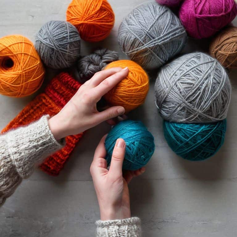
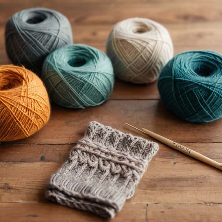
- 6. Next, we’ll swatch and test our colors to see how they work together in practice. This is an essential step, as it allows us to _fine-tune our color palette_ and make any necessary adjustments. I like to create a series of small swatches, using different combinations of colors and yarns to see what works best. This helps me to avoid any _unpleasant surprises_ when I start working on the actual project.
- 7. Finally, let’s talk about trust your instincts and having fun with the process. Choosing colors for a colorwork project is a _creative and iterative_ process, and it’s essential to enjoy the journey and not get too caught up in trying to make everything _perfect_. Remember, the most beautiful colorwork projects are often those that have a sense of _spontaneity and joy_ to them, so don’t be afraid to experiment and try new things.
Choosing Colors With Joy
As I sit with my yarns and swatches, I find myself lost in the world of color harmony in knitting. It’s a realm where the right hues can elevate a design from ordinary to extraordinary. When selecting colors, I consider the yarn weight and color selection, ensuring that the texture and tone of the yarn complement the chosen colors. This synergy is crucial in creating a cohesive and visually appealing piece.
To create a stunning colorwork design, it’s essential to understand the basics of introduction to color theory for crafters. This knowledge helps me navigate the intricate dance of colors, ensuring that my fair isle color combinations are both balanced and striking. By experimenting with different hues and shades, I can develop a unique creating a color palette for textiles that reflects my personal style and aesthetic.
As I work on my colorwork projects, I’m reminded of the importance of understanding contrast in colorwork designs. The interplay between light and dark, warm and cool tones, can make or break a design. By carefully considering these elements, I can craft a piece that is not only beautiful but also engaging and dynamic. With each stitch, I feel a sense of joy and fulfillment, knowing that I’m creating something truly special.
Fair Isle Color Combinations
When it comes to Fair Isle knitting, the key to creating stunning color combinations is to balance warm and cool tones. I love experimenting with earthy shades like moss, sand, and sky blue, which evoke the Scottish landscapes that inspired this traditional technique. By pairing these gentle hues with richer colors like charcoal or burgundy, you can add depth and visual interest to your design.
For a classic Fair Isle look, consider combining 3-5 colors that work in harmony. A neutral background color, like cream or light gray, provides a beautiful base for pops of color from nature-inspired shades like sage, coral, or turquoise. Remember, the fun of Fair Isle knitting lies in its versatility, so don’t be afraid to try out new and unexpected color pairings – you might just discover your new favorite combination!
Introduction to Color Harmony
As I delve into the world of color harmony, I’m reminded of my walks in the countryside, where nature’s palette inspires me. The way the soft greens of the hills blend with the earthy tones of the soil, or how the vibrant wildflowers pop against the serene blue sky – it’s a masterclass in color harmony. When choosing colors for our colorwork project, we can apply these same principles. Consider the 60-30-10 rule, where 60% of the design is a dominant color, 30% a secondary color, and 10% an accent color. This balance creates a sense of visual flow, much like the gentle rustle of leaves in the breeze. By embracing this balance, we can craft a colorwork project that’s not only beautiful but also soothing to the eyes.
Weaving a Colorful Tale: 5 Essential Tips for Choosing Colors with Joy
- Let your surroundings inspire you: take note of the colors in nature, art, and even the hues of your favorite foods to create a unique palette
- Play with contrast: combining light and dark, warm and cool tones can add depth and visual interest to your colorwork project
- Consider the mood you want to evoke: do you want your project to feel calm and soothing, or vibrant and energetic? Choose colors that reflect the atmosphere you desire
- Don’t be afraid to experiment: swatch different color combinations to see how they work together, and don’t be too hard on yourself if it takes a few tries to get it just right
- Trust your instincts: ultimately, choose colors that make you happy and feel true to your personal style – it’s your project, and it should reflect your unique voice
Bringing Color to Life: 3 Key Takeaways
As you embark on your colorwork journey, remember that choosing colors is a personal and creative process – trust your instincts and have fun with it!
Fair Isle color combinations can add a rich, traditional touch to your knitting projects, but don’t be afraid to experiment and add your own modern twist to this classic technique
By embracing the principles of color harmony and allowing yourself to be inspired by the world around you, you’ll be well on your way to creating stunning, one-of-a-kind colorwork pieces that bring you joy and serenity
The Heart of Colorwork
Choosing colors for a colorwork project is like inviting old friends to a party – you want each one to complement the others, to create a harmony that’s greater than the sum of its parts, and to make your heart sing with joy.
Clara Meadows
Weaving a Rainbow: Conclusion
As we come to the end of our journey in choosing colors for a colorwork project, let’s take a moment to reflect on the key points we’ve covered. We’ve explored the importance of color harmony and how it can make or break the overall aesthetic of our project. We’ve also delved into the world of Fair Isle color combinations, discovering how to balance and blend colors to create something truly unique. By considering the introduction to color harmony and the various color combinations available, we can unlock a world of creative possibilities and bring our knitting projects to life.
As you embark on your next colorwork adventure, remember that the true magic lies in the process of creation. Don’t be afraid to experiment, try new things, and trust your instincts. With every stitch, you’re not only creating something beautiful, but also weaving a story that’s uniquely yours. So, go ahead, pick up your needles, and let the colors guide you on a journey of self-expression and joy.
Frequently Asked Questions
How can I ensure that my chosen colors will work well together and create a visually appealing design?
To ensure your colors work well together, consider the 60-30-10 rule: 60% of your design is a dominant color, 30% a secondary color, and 10% an accent color. This balance creates visual harmony and a beautiful, cohesive look.
What are some tips for selecting a dominant color and accent colors for a colorwork project?
When selecting a dominant color and accent colors, I like to think of it as creating a story. Choose a dominant color that speaks to you, then pick accent colors that complement and contrast with it. Consider the 60-30-10 rule: 60% dominant color, 30% secondary, and 10% accent. This balance will create a harmonious palette that’s visually appealing.
Can you provide some guidance on how to choose colors that will complement the texture and fiber of the yarn I'm using?
When it comes to choosing colors that complement the texture and fiber of your yarn, I always say, ‘let the yarn speak to you.’ Consider the natural hues of the fiber, like the warmth of wool or the softness of alpaca. For example, a rustic wool yarn pairs beautifully with earthy tones, while a silky smooth yarn shines in richer, more jewel-toned colors.