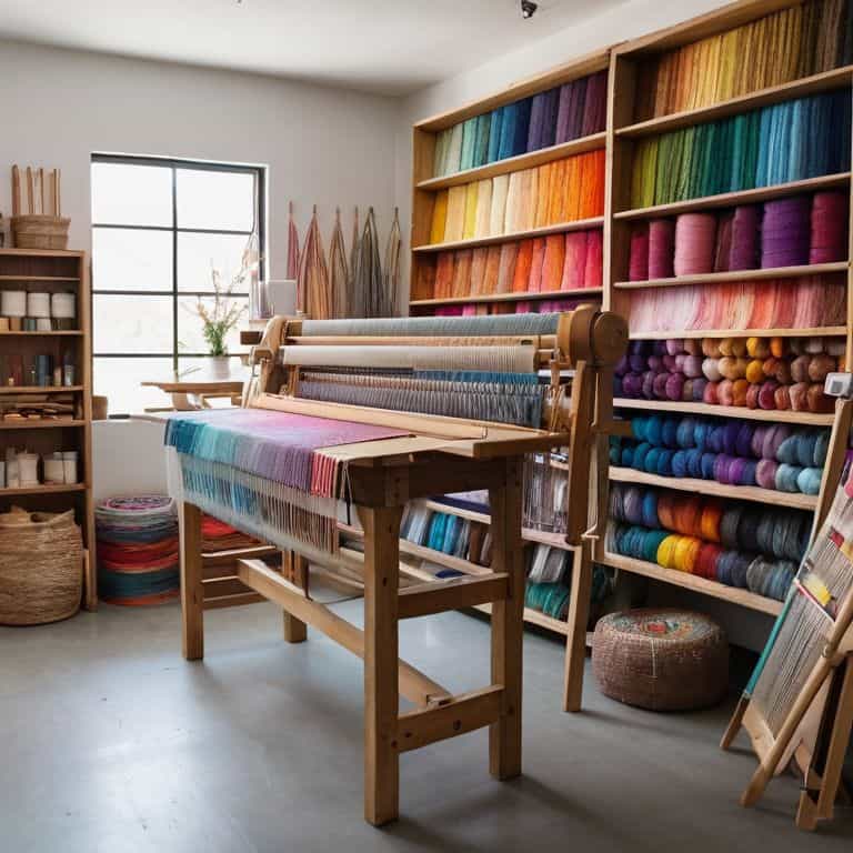
As I sit amidst my loom and threads, I’m reminded of a common myth that frustrates me: that choosing a color palette for weaving is solely about personal taste. But the truth is, a guide to choosing a color palette for weaving is not just about picking colors you like – it’s about understanding how they interact with each other and the texture of your fibers. I’ve seen many weavers struggle with this, including myself when I first started out. My background in architecture has taught me that color and texture are fundamental elements of design, and I’m excited to share my knowledge with you.
In this article, I promise to give you practical advice on how to choose a color palette that brings your woven project to life. We’ll dive into the process of selecting colors that complement your fibers and create a cohesive look. I’ll share my own experiences and tips on how to create a palette that’s uniquely yours, and how to avoid common pitfalls that can make your project look dull or uninviting. By the end of this guide, you’ll be equipped with the knowledge to create a stunning color palette that elevates your weaving to the next level, and you’ll be able to confidently say that you’ve mastered a guide to choosing a color palette for weaving.
Table of Contents
Guide Overview: What You'll Need
Total Time: 1 hour 15 minutes
Estimated Cost: $20 – $50
Difficulty Level: Intermediate
Tools Required
- Color Wheel (for visual reference)
- Thread or Yarn Samples (in various colors)
- Paper or Digital Notebook (for recording color combinations)
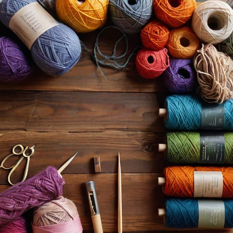
Supplies & Materials
- Weaving Pattern Books (for inspiration)
- Colored Pencils or Markers (for sketching color palettes)
- Fabric or Yarn Swatches (in different textures and colors)
Step-by-Step Instructions
- 1. First, let’s start by exploring your inspiration – what sparks your creativity and guides your color choices? For me, it’s often the textures and hues found in nature, or the clean lines and minimalist aesthetic of architectural photography. Take some time to gather images, fabrics, or objects that resonate with you, and use them as a starting point for your palette.
- 2. Next, consider the mood and atmosphere you want to create with your woven piece. Do you want it to be vibrant and energetic, or calm and soothing? Think about the emotions you want to evoke, and how your color choices can help achieve that. I like to create a mood board with my inspiration images and notes on the feelings I want to convey.
- 3. Now, let’s talk about the color wheel – a powerful tool for creating harmonious palettes. Familiarize yourself with the basics of color theory, and use the wheel to identify complementary, analogous, and triadic color schemes. Don’t be afraid to experiment and find unique combinations that work for you. I often use a color wheel app or print out a physical copy to reference as I work.
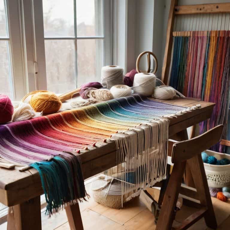
- 4. With your inspiration and mood in mind, start selecting a core color – a dominant hue that will anchor your palette. This could be a bold, bright shade or a more subdued, neutral tone. Consider the natural fibers you’ll be working with, and how their inherent colors will interact with your chosen palette. I often choose a core color that resonates with the texture and tone of my fibers.
- 5. Once you have your core color, it’s time to add depth and interest with secondary and accent colors. Think about how these colors will interact with your core color, and use the principles of contrast and harmony to guide your choices. Remember, less is often more – don’t be afraid to stick with a limited palette and let the textures and tones of your fibers shine.
- 6. Now, let’s consider the neutral elements that will help balance and ground your palette. These could be natural fibers like linen or cotton, or subtle hues like beige or gray. Neutrals can help tie your palette together and provide a sense of calm, so don’t underestimate their importance. I often use neutrals to add visual breathing room to my designs.
- 7. As you finalize your palette, take a step back and evaluate the overall effect. Ask yourself if the colors work together in harmony, and if they evoke the mood and atmosphere you’re aiming for. Don’t be afraid to make adjustments or try out new combinations – the key to a great palette is finding a balance that feels authentically yours.
A Guide to Choosing a Color Palette for Weaving
As I delve into the world of color palettes, I’m reminded of the importance of color harmony in textiles. When selecting a palette, consider the emotional impact you want to convey through your woven piece. Do you want to evoke a sense of calmness or energy? Natural dye color palettes can add a unique touch to your project, as they often feature earthy tones that bring a sense of warmth and coziness.
When exploring different weaving color combinations, I like to think about the cultural influences that have shaped the world of textiles. From the vibrant hues of African kente cloth to the subtle tones of Japanese indigo, each culture has its own distinct approach to color. By drawing inspiration from these traditions, you can add depth and meaning to your woven creations. Yarn weight and color selection also play a crucial role in achieving the desired texture and visual effect.
As the seasons change, so do the colors that inspire me. Seasonal color palettes for weaving can be a great way to stay connected to the natural world and find fresh inspiration for your projects. Whether you’re drawn to the rich tones of autumn or the soft pastels of spring, there’s a world of color waiting to be explored. By embracing the ever-changing landscape of color, you can push the boundaries of your creativity and create truly unique woven pieces that reflect your artistic vision.
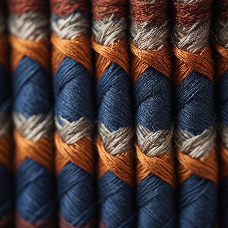
Crafting Color Harmony in Textiles With Yarn Weight
When it comes to crafting color harmony in textiles, yarn weight plays a subtle yet significant role. I like to think of it as the foundation of my woven architecture. Different yarn weights can alter the texture and visual density of a piece, influencing how colors interact with one another. For instance, combining lightweight yarns with heavier ones can create intriguing contrasts that add depth to your design.
By considering yarn weight in your color palette, you can intentionally build layers of visual interest. This might mean pairing smooth, fine yarns with chunky, earthy ones to evoke a sense of organic sophistication. As I sketch out my designs on graph paper, I always think about how different yarn weights will work together to bring my vision to life. It’s a delicate balance, but one that can elevate your woven art from beautiful to breathtaking.
Woven Worlds Natural Dye Color Palettes
As I delve into the world of natural dyes, I’m reminded of the earthy tones that inspired my transition from architecture to weaving. The subtle nuances of plant-based colors – from the soft peach of pomegranate to the deep indigo of woad – add a layer of depth to my woven pieces. I’ve found that natural dye color palettes evoke a sense of organic elegance, as if the fibers themselves are infused with the essence of the natural world.
I often experiment with combining unexpected natural dyes to create unique, nuanced hues. The result is a color palette that feels both earthy and sophisticated, perfect for adding warmth and texture to my large-scale woven installations. By embracing the unpredictability of natural dyes, I’ve discovered a sense of freedom in my design process, allowing the fibers to guide my creative vision.
5 Essential Tips for Crafting a Stunning Color Palette in Weaving
- Consider the emotional impact of your colors: think about the mood and atmosphere you want to create with your woven piece
- Play with contrast: combining different textures, shades, and tones can add depth and visual interest to your work
- Look to nature for inspiration: observe the way colors interact in the natural world, from the subtle hues of a sunset to the vibrant tones of a forest
- Experiment with analogous colors: using colors that are next to each other on the color wheel can create a harmonious and soothing palette
- Trust your instincts: don’t be afraid to take risks and try out new color combinations – it’s all part of the creative process and can lead to unique and exciting results
Key Takeaways for Crafting a Unique Color Palette
I’ve learned that the key to a stunning woven piece lies in its color palette, and by considering the natural world, yarn weights, and personal inspiration, you can create a unique harmony of hues
Experimenting with natural dyes and yarn weights can add depth and texture to your weaving, allowing you to craft a piece that’s not only visually striking but also layered with meaning and story
Ultimately, the art of choosing a color palette for weaving is a journey of discovery, and by embracing your creativity, exploring different materials, and trusting your instincts, you can unlock a world of possibilities and bring your fiber vision to life
Weaving with Intention
A color palette is not just a selection of hues, but a blueprint for the emotional and tactile experience of a woven piece – it’s where the intersection of art and architecture begins.
Ethan Thorne
Weaving a World of Color
As we conclude this journey through the realm of color palettes in weaving, let’s reflect on the key elements that bring a woven piece to life. From the initial stages of selecting a natural dye color palette to the nuanced considerations of yarn weight and its impact on texture, each decision plays a vital role in crafting a cohesive and visually striking work of art. The balance of hues, the interplay of light and shadow, and the tactile experience all contribute to a rich sensory encounter that defines the essence of weaving as an art form. By embracing the principles of color harmony and exploring the vast possibilities of natural dyes and yarn weights, weavers can create pieces that not only adorn spaces but also tell stories and evoke emotions.
The art of weaving is, at its core, about building with yarn, where every thread counts and every color choice is a brush stroke on the canvas of our imagination. As we embark on our own weaving journeys, let’s remember that the true beauty of this craft lies not just in the technical skills we master, but in the creative freedom it offers. So, let’s weave with passion, with curiosity, and with the understanding that every piece we create is a unique manifestation of our inner world, a world of color, texture, and unbridled imagination. In the end, it’s not just about the yarn or the loom; it’s about the stories we tell through the intricate dance of threads, and the worlds we bring to life, one weave at a time.
Frequently Asked Questions
How can I ensure that my chosen color palette will work well with the specific fibers and yarns I've selected for my weaving project?
To ensure your color palette works with your fibers and yarns, consider the natural hues and textures of the materials. For example, linen and raw silk have unique undertones that can influence your palette. I like to create a swatch board with my chosen yarns and fibers to see how they interact with different colors, it’s a simple way to test and refine your palette.
What role does the intended use of the woven piece play in determining the most suitable color palette?
When deciding on a color palette, consider where your woven piece will live. Will it be a statement wall hanging or a cozy throw blanket? The intended use dictates the mood and atmosphere you want to create, influencing your color choices. For example, a piece meant for a bustling space might demand bolder hues, while a bedroom piece might call for softer tones.
Are there any universal color palette principles that can be applied to weaving, regardless of the specific style or design I'm aiming to create?
As an architect-turned-weaver, I’ve found that universal principles like balance, contrast, and harmony apply to weaving, just like building design. Consider the 60-30-10 rule: 60% dominant color, 30% secondary, and 10% accent. This framework helps create visual flow, whether you’re weaving a modern tapestry or a traditional rug.