As I sit amidst my loom and threads, I often hear people say that color theory in weaving is all about following strict rules and formulas. But I’m here to tell you that’s a myth – the truth is, it’s an art form that allows you to build with yarn and create something truly unique. I still remember my early days as an architect, where I’d spend hours poring over blueprints and designing structures that seemed to defy gravity. When I discovered weaving, I realized that it was essentially the same process, but instead of steel and concrete, I was working with threads and fibers. This realization sparked my passion for creating a guide to color theory in weaving, where I could share my knowledge and help others unlock the secrets of this ancient craft.
In this article, I’ll take you on a journey to explore the world of color theory in weaving, and show you how to use colors to bring your woven pieces to life. You’ll learn how to balance hues and * textures* to create stunning patterns and designs. My goal is to provide you with practical advice and inspiration to help you overcome common challenges and take your weaving to the next level. Whether you’re a beginner or an experienced weaver, this guide will help you understand the fundamentals of color theory and how to apply them to create beautiful, one-of-a-kind pieces that reflect your personal style and artistic vision.
Table of Contents
- Guide Overview: What You'll Need
- Step-by-Step Instructions
- A Guide to Color Theory in Weaving
- Weaving a World of Color: 5 Essential Tips to Bring Your Threads to Life
- Key Takeaways for Weaving a World of Color
- Weaving a World of Color
- Weaving a World of Color: A Conclusion
- Frequently Asked Questions
Guide Overview: What You'll Need
Total Time: 3 hours 45 minutes
Estimated Cost: $50 – $100
Difficulty Level: Intermediate
Tools Required
- Loom simple frame or rigid heddle
- Measuring Tape for measuring yarn and fabric
- Scissors dedicated for cutting yarn
- Yarn Needle for weaving in ends
Supplies & Materials
- Yarn various colors and textures
- Shuttle for passing yarn through shed
- Pickup Stick for selecting warp threads
- Color Wheel for reference and planning
- Graph Paper for designing and planning projects, with measurements in inches
Step-by-Step Instructions
- 1. To begin our journey into the world of color theory in weaving, let’s start by understanding the color wheel, which is a fundamental tool for creating harmonious color schemes. The color wheel is a circular representation of colors, with primary colors at the center and secondary colors created by mixing them. I like to think of it as the blueprint for our weaving project, helping us to plan and visualize the final piece.
- 2. Next, we need to consider the principles of color harmony, which include complementary, analogous, and triadic color schemes. Complementary colors are those that are opposite each other on the color wheel, creating a high contrast and visually appealing effect. Analogous colors, on the other hand, are next to each other on the color wheel, producing a more subtle and soothing effect. By applying these principles, we can create a unique and captivating color palette for our woven piece.
- 3. Now that we have a basic understanding of color theory, let’s move on to selecting yarns. When choosing yarns, it’s essential to consider not only the color but also the texture and weight of the yarn. Different yarns can add unique characteristics to our woven piece, from the softness of merino wool to the rustic feel of linen. I like to collect and experiment with various natural fibers, such as raw silk and organic cotton, to create a diverse palette of textures and hues.
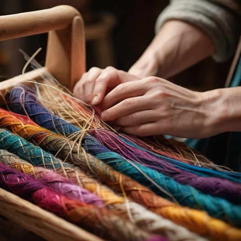
- 4. With our yarns selected, it’s time to create a color board, which is a visual representation of our color palette. Cut small pieces of each yarn and arrange them on a board or paper to see how they interact with each other. This step is crucial in refining our color scheme and ensuring that the final piece will be cohesive and visually appealing. I often take photographs of my color boards to reference later and make any necessary adjustments.
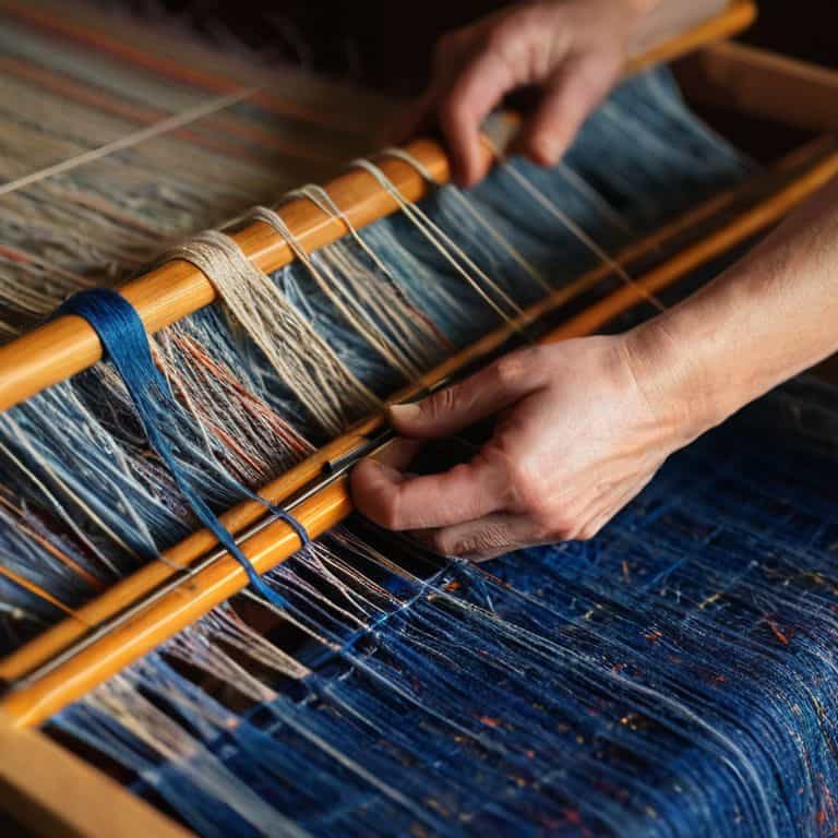
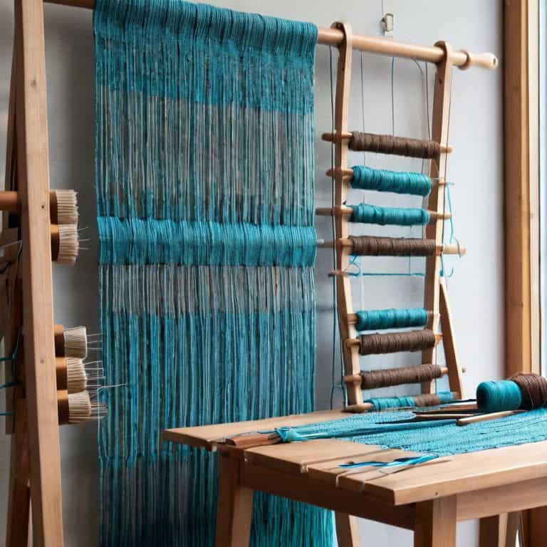
- 5. Once we’re satisfied with our color palette, we can start warping our loom. This is the process of stretching the yarns across the loom to create the foundation for our woven piece. It’s essential to maintain even tension and spacing to ensure that our final piece will be straight and evenly woven. I find that using a simple, repetitive pattern can help to create a sense of calm and focus during this process.
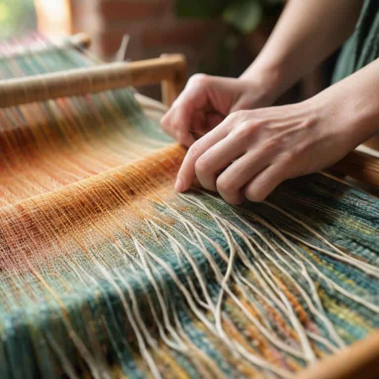
- 6. Now it’s time to start weaving, which is where the magic happens. As we interlace the yarns, we can see our color palette come to life. Remember to experiment and have fun with the process, trying out different patterns and techniques to add depth and interest to our piece. I often find inspiration in the natural world, from the intricate patterns of leaves to the vibrant colors of sunsets.
- 7. As we near the completion of our woven piece, let’s take a step back and evaluate the overall composition. Consider the balance of colors, textures, and patterns, and make any necessary adjustments. Ask yourself if the piece is visually appealing, and if it effectively communicates the message or emotion you intended to convey. I believe that this is where the true artistry of weaving comes into play, as we refine our creation and bring it to life.
A Guide to Color Theory in Weaving
As I delve deeper into the world of color theory in weaving, I’m reminded of the importance of weaving color combinations that evoke emotions and create a sense of harmony. When selecting yarns, I consider the 60-30-10 rule, where 60% of the piece is a dominant color, 30% a secondary color, and 10% an accent color. This principle helps me achieve color harmony principles that are both visually appealing and balanced.
When working with natural dyes, I’ve found that natural dye techniques can add a unique depth and richness to my woven pieces. The process of experimenting with different plant-based dyes and observing how they interact with various yarns is both fascinating and rewarding. By understanding how to harness the power of natural dyes, I can create complex, multi-dimensional colors that add an extra layer of interest to my textiles.
As I build my woven pieces, I’m constantly aware of the yarn color selection tips that will bring my vision to life. I consider the interplay between weft and warp colors, and how they’ll interact to create a sense of texture and visual interest. By carefully selecting yarns that work together in harmony, I can create a sense of color gradation in textiles that draws the viewer’s eye through the piece, inviting them to explore the intricate world of woven color.
Natural Dye Techniques for Unique Hues
As I experiment with natural dyes, I’m reminded of the thrill of discovering new textures and hues. I love foraging for plants like indigo, pomegranate, and turmeric to create unique shades. The process of coaxing color from nature is almost magical. By combining these dyes with different fibers, I can achieve a wide range of subtle, earthy tones that add depth to my woven pieces.
I’ve found that natural dyes can be unpredictable, but that’s part of their charm. The variations in color can create a sense of history and character in my work, much like the patina on a well-worn wooden beam. By embracing the unpredictability of natural dyes, I can craft weaving that feels truly organic and connected to the natural world.
Weaving Color Combinations With Harmony
As I sit at my loom, threads of varying hues laid out before me, I’m reminded of the architectural principle of harmony. Just as a well-designed building balances form and function, a woven piece must balance color and texture. To achieve this harmony, I consider the 60-30-10 rule: 60% of the piece features a dominant color, 30% a secondary color, and 10% an accent color. This ratio creates a sense of visual equilibrium, allowing the eye to flow effortlessly across the woven landscape.
By applying this principle, I’ve created stunning color combinations that elevate my woven art installations. For example, pairing earthy tones like oatmeal and sage with a pop of indigo can evoke a sense of natural sophistication. The key is to experiment and trust your instincts, just as an architect would when designing a new structure. As you weave, remember that each thread is a building block, working together to create a harmonious whole.
Weaving a World of Color: 5 Essential Tips to Bring Your Threads to Life
- Start with a neutral background: Choose a base color that complements your yarn collection, allowing each thread to shine in its own unique way
- Experiment with analogous colors: Select hues that are next to each other on the color wheel to create a harmonious palette that invites the eye to wander
- Play with texture and saturation: Combine smooth and rough yarns, and balance light and dark shades to add depth and visual interest to your woven piece
- Consider the 60-30-10 rule: Allocate 60% of your palette to a dominant color, 30% to a secondary hue, and 10% to an accent color to achieve a balanced and visually appealing design
- Trust your instincts and break the rules: Remember, color theory is a guide, not a law – feel free to push boundaries and create unique combinations that reflect your personal style and artistic vision
Key Takeaways for Weaving a World of Color
I’ve learned that understanding color theory is essential to creating woven pieces that evoke emotion and tell a story, and it’s all about experimenting with different threads and hues to find the perfect balance
By applying principles of harmony, such as analogous, complementary, and triadic color combinations, we can add depth and visual interest to our woven art, making it truly unique and captivating
Natural dye techniques can add an extra layer of uniqueness to our woven pieces, and I’m excited to continue exploring the endless possibilities of color and texture in my own weaving practice, and I hope you’ll join me on this creative journey
Weaving a World of Color
As I weave, I’m reminded that color theory is not just a principle, but a poetic language – one that speaks directly to the soul, thread by thread, hue by hue, until the very fabric of reality is reborn in texture and tone.
Ethan Thorne
Weaving a World of Color: A Conclusion
As we conclude this journey through the world of color theory in weaving, it’s essential to reflect on the key takeaways. We’ve explored the fundamentals of color combinations, delving into the principles of harmony and how to apply them to create unique, visually striking pieces. We’ve also touched upon the art of natural dye techniques, which can add an extra layer of depth and character to your woven creations. By understanding how to balance colors and experiment with different hues, you’ll be well on your way to crafting woven pieces that are not only beautiful but also tell a story. Whether you’re a seasoned weaver or just starting out, the world of color theory is full of endless possibilities waiting to be discovered.
As you embark on your own weaving journey, remember that the true magic happens when you allow yourself to experiment and push boundaries. Don’t be afraid to try new color combinations, to play with textures, and to see where the thread takes you. Weaving is an art form that invites you to slow down, to be present, and to connect with the natural world. As you sit at your loom, surrounded by yarns and fibers, remember that you are not just creating something – you are building a world, one thread at a time. And it’s in this world of color, texture, and form that you’ll find the true beauty of weaving.
Frequently Asked Questions
How can I apply the principles of color theory to create a cohesive and harmonious palette in my woven pieces?
To create a cohesive palette, I consider the 60-30-10 rule: 60% dominant color, 30% secondary, and 10% accent. I also experiment with analogous and complementary colors to add depth and visual interest, much like an architect balances form and function in a building design.
What are some common mistakes to avoid when combining different colors and textures in weaving?
When combining colors and textures, I’ve found that avoiding clashing hues and over-mixing patterns is key. Too many contrasting elements can create visual noise, disrupting the harmony of the piece. Instead, balance bold colors with neutral textures, and let each element breathe – just as I do in my architectural photography, where negative space tells a story.
Can you provide examples of how natural dyes can be used to create unique and subtle color variations in woven art?
I love experimenting with natural dyes to create subtle, earthy hues. For instance, I’ve used indigo to achieve a range of blues, from soft sky tones to deep navies, and pomegranate to produce warm, coral-inspired shades. These unique colors add an organic depth to my woven pieces, blurring the line between nature and architecture.