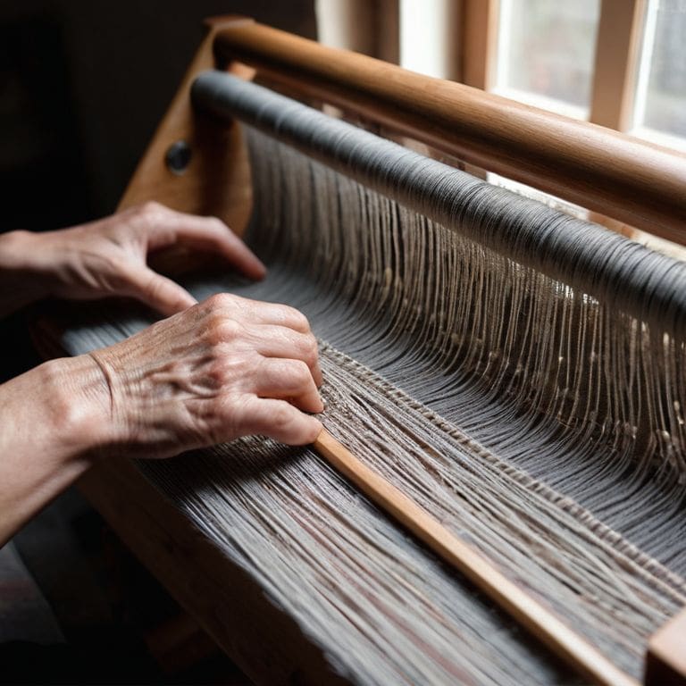
As I sit amidst my loom and half-finished weaving projects, I often think about the concept of what is value in color theory for weavers. It’s a topic that’s often shrouded in mystery, with many weaving enthusiasts believing it’s only accessible to those with a background in art or design. But I’m here to tell you that’s simply not true. In fact, understanding value in color theory is more like building with yarn, where every thread and fiber plays a crucial role in creating a cohesive and beautiful piece.
My goal with this article is to provide you with a no-nonsense guide to understanding value in color theory, specifically tailored for weavers. I’ll share my personal experiences, tips, and tricks for creating stunning woven pieces that showcase a deep understanding of value and texture. By the end of this journey, you’ll be equipped with the knowledge to elevate your weaving practice and create pieces that are truly works of art. Whether you’re a seasoned weaver or just starting out, I invite you to join me as we explore the fascinating world of color theory and its application in weaving.
Table of Contents
Weaving Value Essentials
As I delve into the world of color theory, I find myself drawn to the color harmony principles that govern the way we perceive and interact with different hues. When it comes to weaving, understanding these principles is crucial in creating pieces that are not only visually striking but also cohesive and balanced. I’ve found that weaving with analogous colors can add a level of depth and sophistication to my work, allowing me to experiment with subtle variations in tone and texture.
One of the most essential tools in my weaving toolkit is the value scale in textile design. This simple yet powerful concept allows me to map out the lightness and darkness of different colors, creating a visual framework for my work. By using this scale, I can create texture with color, adding layers of interest and complexity to my woven pieces. Whether I’m working with bold, contrasting hues or subtle, monochromatic shades, the value scale helps me to balance and harmonize my colors.
As a weaver, I’m constantly seeking new ways to express myself through my craft. Monochromatic weaving techniques have become a favorite of mine, as they allow me to explore the nuances of a single color in depth. By varying the value and texture of my yarns, I can create intricate, detailed pieces that showcase the beauty of a single hue. This approach also enables me to focus on the color theory for fiber artists, considering how different colors interact and influence one another in the context of my woven work.
Color Harmony Principles Unraveled
When it comes to color harmony, I find that understanding the principles of monochromatic color schemes can be incredibly powerful in weaving. By using different shades of the same color, you can create a sense of cohesion and depth in your pieces. This approach allows you to experiment with various textures and yarn weights, adding complexity to your work without introducing conflicting hues.
As I delve into the world of color harmony, I’m reminded that balance is key to creating visually stunning pieces. By carefully considering the relationship between light and dark, warm and cool colors, you can craft a woven work that is both aesthetically pleasing and thought-provoking.
Monochromatic Weaving Techniques
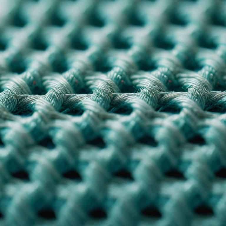
When working with monochromatic colors, I love to experiment with texture to add depth and visual interest to my woven pieces. By using different yarn weights, weaving techniques, and densities, I can create a range of subtle variations that elevate the overall design. This approach allows me to focus on the nuances of tone and shade, rather than relying on bold color contrasts.
In my own practice, I’ve found that gradual transitions between light and dark shades can create a sense of movement and energy in a monochromatic piece. By carefully planning the sequence of tones, I can guide the viewer’s eye through the composition and create a sense of dynamic flow. This technique requires patience and attention to detail, but the results are well worth the effort.
What Is Value in Color Theory
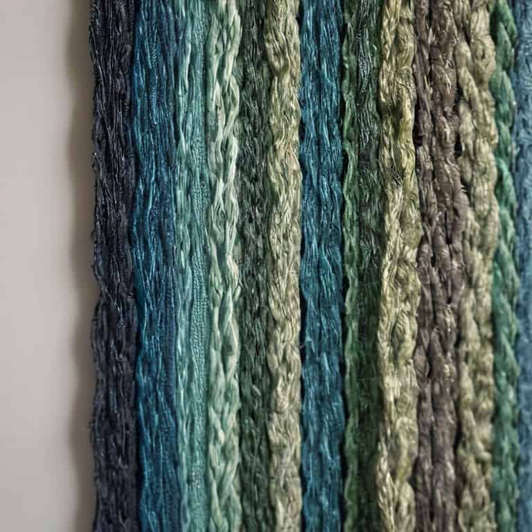
As I delve into the world of color theory, I’m reminded of the importance of value in creating depth and dimension in my woven pieces. Value refers to the lightness or darkness of a color, and it’s a crucial element in color harmony principles. When working with fiber, understanding value allows me to create a sense of texture and visual interest. I often experiment with weaving with analogous colors to produce a soothing and cohesive effect.
In my experience, mastering the value scale in textile design is key to achieving balance and harmony in my work. By carefully selecting colors with varying lightness and darkness, I can guide the viewer’s eye through the piece and create a sense of movement. This is particularly important when working with monochromatic weaving techniques, where the subtle nuances of value can make or break the overall effect.
As a textile artist, I’m always looking for ways to create texture with color. By manipulating value, I can add depth and dimension to my woven pieces, creating a tactile experience for the viewer. Whether I’m working with bold contrasts or subtle gradations, understanding value is essential to bringing my vision to life. By applying color theory for fiber artists, I can unlock new possibilities and push the boundaries of what’s possible with fiber and thread.
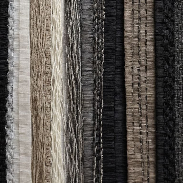
Creating Texture With Analogous Colors
When working with analogous colors, I love to experiment with different textures to add depth to my woven pieces. By combining similar hues, I can create a sense of cohesion that ties the entire piece together. This allows me to focus on playing with various yarn weights, weaves, and materials to introduce visual interest.
As I weave, I consider how each thread interacts with the ones surrounding it, creating a intricate dance of texture and color. I find that using analogous colors enables me to emphasize the tactile quality of the fibers, inviting the viewer to touch and explore the piece. By balancing smooth and rough textures, I can craft a woven artwork that is both visually striking and emotionally resonant.
Woven Light and Shadow Explained
As I delve into the world of value in color theory, I’m reminded of the intricate dance between light and shadow that occurs within my woven pieces. The way a single thread can catch the light and cast a subtle shadow, adding depth and dimension to the overall design, is truly captivating.
In my experience, balance is key when it comes to weaving light and shadow. By carefully considering the interplay between light and dark values, I can create a sense of visual interest that draws the viewer in and encourages them to explore the texture and form of the piece.
5 Essential Tips for Mastering Value in Color Theory as a Weaver
- Emphasize texture over hue: by playing with different values, you can add depth and visual interest to your woven pieces, even with a limited color palette
- Experiment with analogous colors: using colors that are next to each other on the color wheel can create a sense of harmony and cohesion in your weaving, and value can help take it to the next level
- Consider the 60-30-10 rule: allocate 60% of your weave to a dominant value, 30% to a secondary value, and 10% to an accent value to create balance and visual appeal
- Pay attention to the value of your background: whether you’re using a solid color or a subtle pattern, the value of your background can make or break the overall impact of your woven piece
- Don’t be afraid to go monochromatic: using different values of the same color can create a stunning, sophisticated effect in your weaving, and is a great way to practice working with value in color theory
Key Takeaways: Weaving with Value in Color Theory
I’ve learned that understanding value in color theory is crucial for adding depth and dimension to my woven pieces, and it’s all about balancing light and dark to create visually appealing textures
By applying principles of color harmony, such as monochromatic and analogous color schemes, I can create cohesive and stunning textiles that showcase the beauty of value in color theory
Ultimately, mastering value in color theory has allowed me to think of my woven art as a form of architectural design, where every thread and every shade contributes to the overall structure and aesthetic of the piece
The Essence of Value
Value in color theory is the loom on which light and shadow are woven, bringing depth and dimension to the very fabric of our creations, reminding us that in the dance between darkness and illumination lies the true beauty of texture and form.
Ethan Thorne
Weaving a New Perspective
As we’ve explored the concept of value in color theory, it’s become clear that understanding light and shadow is crucial for weavers. From the color harmony principles that guide our creative decisions to the monochromatic weaving techniques that add depth to our work, every element plays a role in crafting a visually stunning piece. By recognizing the importance of value, we can elevate our weaving from a simple craft to a form of artistic expression. Whether you’re working with analogous colors to create texture or experimenting with new materials, the key is to approach your loom with a sense of curiosity and wonder.
As you continue on your weaving journey, remember that the true magic happens when you embrace the intersection of art and craft. Don’t be afraid to experiment, to push the boundaries of what’s possible with fiber and thread. With every passing project, you’ll find that your understanding of value in color theory deepens, and your creations become more nuanced, more textured, and more alive. So go ahead, build with yarn, and watch as your woven pieces transform into breathtaking works of art that inspire and uplift all who see them.
Frequently Asked Questions
How can I effectively use value in color theory to create depth and dimension in my woven pieces?
To create depth and dimension, I experiment with contrasting values – light and dark – to build visual interest. By juxtaposing rich, dark hues with lighter ones, I craft a sense of layering and texture, drawing the viewer’s eye into the woven piece. It’s akin to designing a building’s façade, where shadows and light dance to reveal its form.
What role does texture play in enhancing the value of colors in weaving?
For me, texture is the foundation of weaving, and it plays a pivotal role in enhancing color value. By combining different yarn weights, materials, and weave structures, I can create intricate textures that either absorb or reflect light, thereby deepening or enriching the colors and adding layers of visual interest to my pieces.
Can you provide examples of how to apply value in color theory to different types of weaving, such as tapestry or rug weaving?
Let’s explore value in action – for tapestry weaving, I use high-contrast values to create depth, while in rug weaving, subtle value shifts can evoke a sense of texture and dimension, like the play of light on a natural fiber.