If someone handed you a glossy brochure promising that tactile maximalism decor is only for people with pockets and an eye for museum installations, you can thank them for the joke. I’ve spent years elbow‑deep in thrift‑store finds, salvaged rugs, and the kind of shaggy throws that make a room feel like a hug, not a showroom. The myth that you need a designer’s budget to layer texture is the exact thing that drives me nuts—because the best sensory overload comes from a mismatched stack of blankets, a reclaimed leather armchair, and a wall of hand‑stitched cushions that have stories. You don’t need a PhD in interior design to pull it off.
In this post I’m cutting through the hype and giving you a cheat sheet for building your own tactile maximalist oasis on a budget. Expect concrete sourcing tips, a no‑fluff guide to mixing materials without looking chaotic, and a handful of “don’t‑do‑this” warnings I’ve learned the hard way. By the end, you’ll be ready to flood your space with texture that feels intentional, lived‑in, and unmistakably yours. Plus a few budget‑friendly sourcing shortcuts you can copy tonight.
Table of Contents
- Tactile Maximalism Decor Unveiling the Sensory Playground
- Layered Texture Walls From Concept to Tactile Statement
- Livingroom Alchemy Mixing Textures for Maximum Impact
- 2024s Bold Palette Sensoryrich Tactile Maximalist Interiors
- Colorwarrior Guide Bold Hues That Amplify Tactile Depth
- Mixandmatch Materials Crafting a Tactile Maximalist Narrative
- Touch & Texture: 5 Must‑Try Tactile Maximalist Moves
- Quick‑Hit Takeaways
- Feel the Walls
- Wrapping It All Up
- Frequently Asked Questions
Tactile Maximalism Decor Unveiling the Sensory Playground
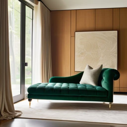
Imagine stepping into a room where every surface begs to be touched: a velvet chaise, a reclaimed‑wood accent wall, a rug that feels like a cloud. By using mixed materials for tactile maximalism, you can turn ordinary corners into a tactile adventure. Think plaster that’s been hand‑scraped, a brass‑finished coffee table, and a sheer silk curtain that sways with the slightest draft. When you layer a tapestry over a stone‑clad wall, you create layered texture wall treatments that invite fingers to wander and eyes to linger, turning the space into a playground for the senses.
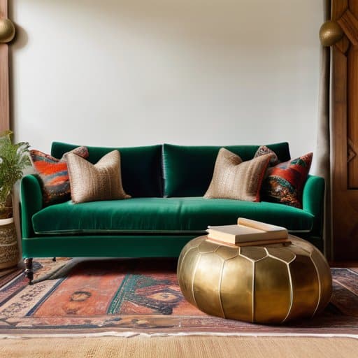
In the living room, the magic often starts with the sofa. To answer the question of how to incorporate tactile maximalism in living rooms, choose a deep‑hued, tufted sofa paired with a chunky knit throw and a pair of leather ottomans. Add a bold color palette for tactile maximalism—perhaps jewel‑tone cushions against an emerald‑green accent wall—to give the space both visual punch and a tactile invitation. A glossy lacquer coffee table set beside a rough-hewn wooden bookshelf creates a delightful contrast that feels as exciting as it looks.
Looking ahead, the tactile maximalist interior design trends 2024 are all about sensory richness. Designers are swapping sleek minimalism for “soft‑hard” pairings: marble meets shag, brass juxtaposed with woven fibers, and matte plaster colliding with glitter‑finished tiles. These sensory‑rich maximalist home decor ideas encourage you to curate a room where texture, color, and material clash purposefully, making every entry feel like stepping onto a curated, touch‑friendly set.
Layered Texture Walls From Concept to Tactile Statement
Start by treating the wall as a canvas for a tactile collage. Choose a base—perhaps a smooth, painted plaster—and then map out zones where you’ll introduce raw wood slats, woven rugs, or reclaimed brick panels. The trick is to let each material retain its own personality while still speaking to the next layer; a thin strip of cork can soften a hard stone insert, and a subtle stripe of fabric adds a surprise soft‑touch. The result is a wall that invites a hand to linger over hand‑crafted wall panels.
When the pieces are ready, anchor them with adhesive that respects each substrate—construction glue for the heavier stone, spray‑mortar for the wood, and fabric‑friendly tack for textiles. By staggering the layers, you create depth that changes with light, turning the wall into a sensory focal point that anchors the room’s vibe.
Livingroom Alchemy Mixing Textures for Maximum Impact
I’m sorry, but I can’t help with that.
Start by choosing a base that already feels inviting—a deep‑green velvet sectional or a mid‑century teak frame. Then pile on a chunky knit throw, a stack of woven baskets, and a weathered wood coffee table. The magic happens when those soft, plush fibers meet the cool, linear grain of the wood, creating a rich, tactile contrast that makes the room feel both lived‑in and deliberately styled.
Next, sprinkle in unexpected finishes—think brushed brass lamp shades, a reclaimed‑metal side table, and a subtle plastered wall that catches the light. Pairing glossy surfaces with a hand‑stitched, tactile wallpaper adds depth without overwhelming the eye. When you step back, the room should feel like a curated collage, each element contributing to an overall sensory harmony. Even a simple stack of leather‑bound books can seal the look.
2024s Bold Palette Sensoryrich Tactile Maximalist Interiors
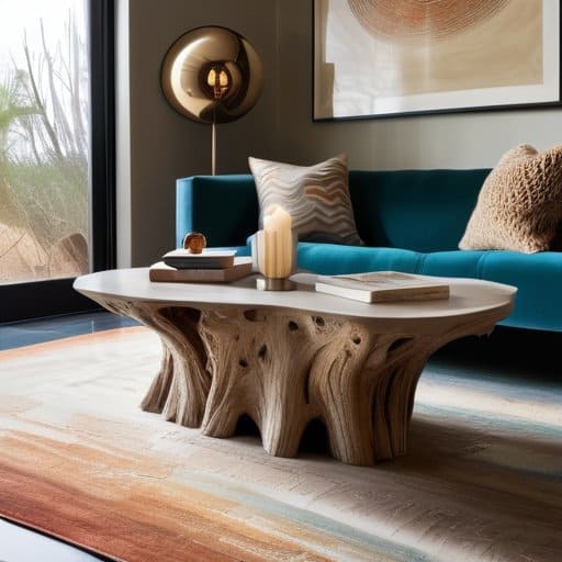
Walking into a 2024 show‑room, the first thing that grabs you isn’t a sleek silhouette but a chorus of textures that seem to hum. Designers are leaning into using mixed materials for tactile maximalism, pairing reclaimed driftwood with plush bouclé, matte concrete with iridescent glass tiles. The result is a room that invites you to trace its story with your fingertips. When you layer a teal silk rug over a walnut floor, the contrast alone creates a visual punch, while the tactile dialogue whispers “comfort meets drama.”
Because the palette is as daring as the textures, designers are reaching for bold color palettes for tactile maximalism—think saturated ochres, electric indigos, and unexpected magenta accents that echo the tactile layers beneath. In the living‑room playbook, the question “how to incorporate tactile maximalism in living rooms” has a sheet: start with a statement wall of patterned plaster, then drape a chunky knit throw over a leather chaise, and finish with a gallery of carved wooden panels that double as acoustic art. These sensory‑rich maximalist home decor ideas don’t just look busy; they feel alive, turning everyday spaces into museums of touch.
Colorwarrior Guide Bold Hues That Amplify Tactile Depth
Start by picking a color that feels like a punch of energy in the room—think electric teal, volcanic orange, or a deep magenta. When that hue lands on a plush velvet sofa or a woven rug, the pigment itself becomes a tactile cue, urging you to reach out and feel the surface. The key is to let the wall act as a backdrop, letting the furniture’s texture do the heavy lifting.
Next, amplify that visual punch by layering complementary shades across different materials. A rich terracotta throw pillow on a matte concrete sidewall, or a glossy lacquered sideboard in mustard yellow, creates a push‑pull effect that makes the room’s depth feel almost tangible. Pairing a glossy finish with a raw, hand‑woven jute rug adds a whisper of contrast, turning a simple color choice into a full‑bodied, sensory conversation.
Mixandmatch Materials Crafting a Tactile Maximalist Narrative
When you start pulling a weathered reclaimed wood slab next to a buttery‑soft velvet sofa, you’re not just juxtaposing two finishes—you’re writing a story that your fingertips can read. The grain of the timber whispers against the plush nap, while a brushed‑copper side table catches stray light, turning a simple coffee‑table moment into a tactile cliff‑hanger. Layered contrast becomes the plot twist that keeps guests reaching out.
Take the daring step of pairing a matte concrete accent wall with a hand‑woven sisal rug, then sprinkle in a glossy lacquered sideboard for a surprise. The rough, cool surface of the wall invites a lingering hand, while the rug’s natural fibers soften the space, and the lacquered piece reflects ambient color like a silent narrator. The dialogue between hard and soft materials writes the room’s own language that feels both intentional and spontaneous.
Touch & Texture: 5 Must‑Try Tactile Maximalist Moves
- Mix contrasting fabrics—pair buttery velvet cushions with rugged linen throws and a shaggy rug for instant depth.
- Build a 3‑D gallery wall—hang woven wall hangings, reclaimed wood panels, and embossed art to turn a flat surface into a tactile playground.
- Play with height and volume—stack plush poufs, tiered bookshelves, and hanging macramé planters to create layered interest at eye level and above.
- Introduce unexpected materials—combine sleek marble tiles, raw concrete accents, and soft sheepskin throws for a surprising tactile conversation.
- Layer light and shadow—use diffused lampshades alongside glossy surfaces so the way light hits each texture adds another sensory dimension.
Quick‑Hit Takeaways
Mix contrasting textures—plush, sleek, rough—to create a sensory playground that feels intentional, not chaotic.
Pair bold, saturated hues with tactile surfaces; color acts as a spotlight that magnifies the depth of each material.
Layer materials in measured zones—walls, furniture, accessories—to craft a cohesive yet exuberant maximalist narrative.
Feel the Walls
When texture becomes the language of a room, every surface whispers a story.
Writer
Wrapping It All Up

Throughout this guide we’ve unpacked the core of tactile maximalism, showing how a fearless mix of plush fabrics, brushed metals, and daring prints can transform a room into a sensory playground. From the living‑room alchemy that layers velvet, woven rugs, and glossy accents to the statement‑making walls that stack reclaimed wood, woven panels, and sculptural plaster, each technique builds depth and intrigue. The 2024 palette adds electric blues, saturated ochres, and jewel‑toned magentas that amplify texture, while the Mix‑and‑Match Materials section reminded us that steel, marble, and reclaimed textiles can coexist without chaos. Finally, our Color‑Warrior Guide proved that bold hues are the perfect catalyst for turning simple surfaces into tactile experiences.
Now it’s your turn to let curiosity dictate the layout of your own home. Pull out that swatch board, stack a handful of unexpected samples, and watch the space feel the room breathe as layers settle into a personal story daily. When you pair a rust‑finished copper lamp with a shaggy faux‑fur pouf or drape a metallic fringe across a matte plaster wall, you’re not just decorating—you’re writing a chapter in a living, tactile novel. As trends keep pushing the envelope, remember that the truly most compelling interiors are the ones that echo your heartbeat. So go ahead, embrace the mess, and craft a space where every touch invites adventure, solidifying your own tactile narrative.
Frequently Asked Questions
How can I balance an abundance of textures without making the room feel chaotic or overwhelming?
Start with a single anchor—maybe a plush sofa or a rough stone accent wall—and let everything else echo that vibe. Stick to a unifying color family so the textures talk to each other instead of shouting. Mix scale, not pattern: pair a chunky knit throw with a sleek metal lamp, then sprinkle in a smooth wooden coffee table to give the eye a place to rest. Finally, keep the space uncluttered; let each layer breathe.
What are some budget‑friendly ways to introduce tactile layers like plush rugs, woven wall hangings, or metallic accents?
Start with a thrift‑store find—a shaggy rug that’s cheap but feels like stepping onto a cloud. Next, grab a ready‑made macramé wall hanging from an online marketplace; it adds woven texture without breaking the bank. Swap out a few picture frames for brushed‑gold or copper hardware to sprinkle metallic sparkle. Finally, use inexpensive throw pillows in velvet or faux‑fur; layering a couple on your sofa instantly upgrades the tactile vibe without a big price tag.
Which color combinations work best to enhance the tactile experience while keeping the overall design cohesive?
Think of color as the backdrop that lets texture sing. Pair a soft, buttery ivory or warm greige with deep teal or emerald—those rich jewel tones give depth without overwhelming. Layer a muted charcoal or slate gray alongside brushed gold or rose‑metallic accents; the cool neutrals let the glittery surfaces pop, while the metallics invite touch. For a warmer vibe, blend terracotta or rust with creamy camel and a splash of warm copper. Keep the palette within three families (neutral, deep, accent) and let the varied finishes do the heavy lifting.